Another Iron Painter entry from me: The Automaton.
The robot is based on this illustration for a
Magic:The Gathering card:
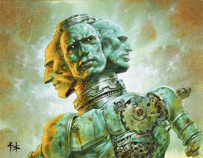 |
| Proteus Machine. Artwork by Greg Staples. © Wizards of the Coast |
I wanted to make a clockwork automaton like that one for Gardens at some point. As a mercenary or even a part of a whole new faction. I made a skech and notes for later.
But round 3 of Iron Painter had a theme in which such a miniature would fit, so I used the opportunity. But I had to turn the idea into something a bit more elaborate than a gaming piece. Not that I cannot still use him for games; it would not be too complicated to make him removable from the large base to a 30mm round one.
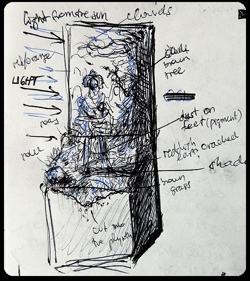 |
| Sketch of the composition. |
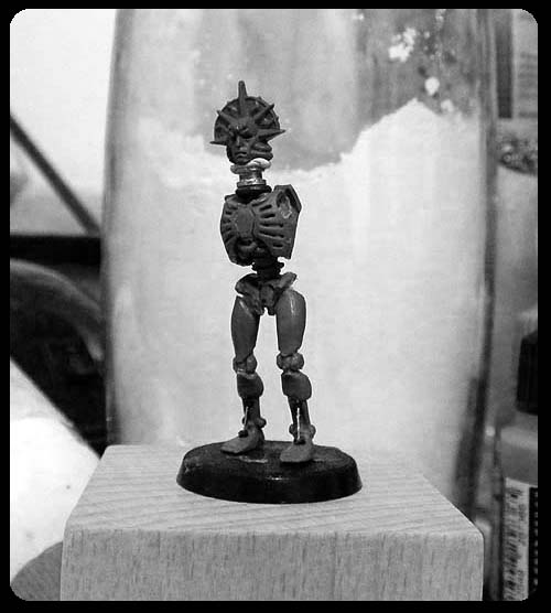 |
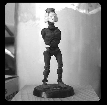
| The robot started as a Necron Warrior. |
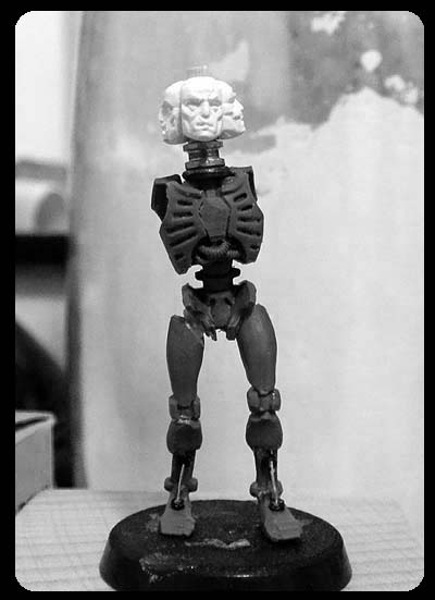 |
| The faces are 40K Blood Angel masks. I made copies rather than cutting the actual bits. |
 |
| Originally I meant to make the head actually rotateable. However, since I later decided that I want dramatic lighting coming from one side of the scene, this idea didn't seem right any more. I ended up gluing it in place. |
 |
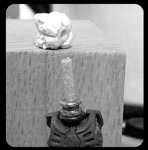
| The torso needed some sculpting. |
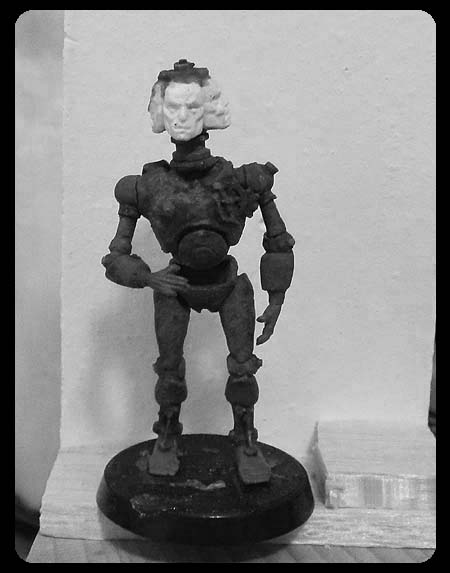 |
| The finished conversion. |
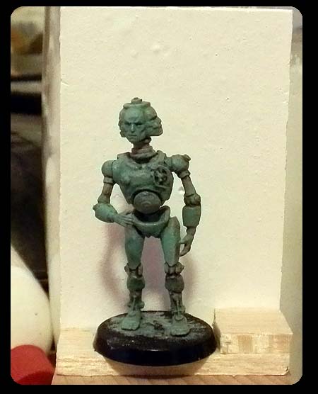 |
| Once again I relied a lot on washes and glazes when painting the miniature. |
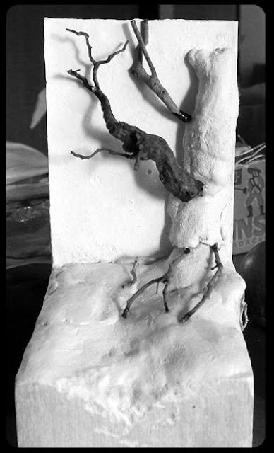 |
| The base was simpler than the last one. I used air-drying clay, plaster and real tree roots. |
The feel I was hoping I would get was that of an old-school SF illustration. I think I did that part right. But there is just something missing. The scene seems to me too static, too dull. Do you have the same feeling? How would you fix it? It's too late now to improve it for the competition, but at least I can learn for next time.


I really enjoy seeing your creative work, always very original :)
ReplyDeleteThat said, I'd agree with you about the "static" impression of the scene. Probably because IMHO the backdrop looks to be windswept, but he's standing still. Maybe if you had him in a walking stance or if he was reaching out for something it may help the scene?
It's still the bomb though :)
Thank you! And thanks for the suggestion how to fix it.
DeleteThat is truly fantastic work! My only criticism would be that the colours on the automaton look a little warm compared to the coldness of the palette in the illustration.
ReplyDeleteRegarding the backdrop, I think the automaton looks too static because you've chosen a very organic background for it that's full of movement. I think a more arid backdrop (something like unto Forbidden Planet) might give the automaton more movement.
Thanks, Rebecca! :)
DeleteIt wasn't my aim to copy the illustration completely to the last detail, so it does not bother me that the colour does not match perfectly.
Another fantastic piece, and quite different from your usual work. I love the shades of blue/green you've painted it in, any tips?
ReplyDeleteThe comparatively bland backdrop works for me. Seeing it standing still amongst the red sands and dead plantlife conjures images of it being forgotten and left to wander around, perhaps running through a pre-programmed routine or waiting patiently for new instructions. The contrasting colours really help to seperate it from the world it's standing in, like it really doesn't belong or understand where it is.
Thank you, Remnante!
DeleteThe automaton's blue-green was painted from a very light grey undercoat. I first put several coats of lightly watered down Citadel Nihilakh Oxide to get that teal colour, and after that washed it a couple times with watered down Agrax Earthshade. I think the only picture of painting in progress you can find in the post was taken at this point. After that I shaded some spots with more brown wash and highlighted others with a light grey and white to accentuate the detail. I used a bit of Typhus Corrosion for weathering.
His right-hand side has an orange/yellow tint (just like the tree and rocks on the base) because I wanted the alien sun's light to fall on him from that side.
Thanks for the reply! I had never considered painting with Nihilakh Oxide, might have to pick some up.
DeleteI didn't even notice the lighting, it's very well done :)
Beautiful and inspiring as usual...
ReplyDeleteAnswering your question, I think that the background is perfect but I would change a little bit the pose of the miniature, for me it looks too stif. Maybe a chenge in the pose of the legs, or an arm holding the tree while he walks down the path...
Still it is unbelievable how your work inspires me. I must say that there is no other artist today that makes me so thrilled with their work.
all the best (all the way from Brazil) :)
Silvio
Thank you Silvio! :)
DeleteGiven that he's a robot, his rather static pose doesn't bother me too much. I really like the concept of the rotating faces. Quite creepy, somehow.
ReplyDeleteI think part of the static quality comes from his pose - it's not dynamic, in that he's just standing there - but also from him facing straight on to the viewer. If he was turning slightly or reacting to something "out of scene" it would look more dramatic. He needn't be leaping around, just slightly twisting at the waist, say.
A friend of mine works in a gallery and has a theory that sculptures are more dynamic when there's a turning, twisting sort of movement within the figure. I think it works for miniatures too. I may do a blog post about it, now I think of it.
Thank you! If you do make a blog post about it, drop me a link. :)
DeleteHi,
ReplyDeletehaving problems with my eyes I cannot read much on the computer,
so I did't read everything yet. I'd really love to dig deeper in your stuff...
Since I found your blog via Dave Taylors Blogroll some time ago
I am a big fan of your work. I love how you turn those GW models into something totally new with this slight Bosch / Momento Mori vibe. You truly understand how to convert and paint in favor of this dark distraught look.
Whish GWs design would have taken a similar path. X)
There are just two things which really bug me.
A lot of your pictures seem to be pretty small, even when you click on them. Two to three times the current size in order that they are full-screen and you can see them in all their glory with all the tiny details would be really nice.
Converting stuff myself once in a while I am always interested in the materiality of other peoples conversions, but the B&W nature of your work in progress photos makes it kinda hard to identify the different parts.
Yeah I know the colors fit the theme, but you can still make a black and white versiion from the finished piece in the end.
Anyway, keep up the good work.
Best regards,
Alex
Thank you, Alex! :)
DeleteLet me address the two things that bug you about the blog.
Regarding picture size - I think the pictures are large enough for the viewer to see the miniatures well. Some are a bit bigger than they show in the blog; I don't know if you tried clicking on them, and then when the overlay appears right-clicking on the image and choosing 'View Image'. It will open in its original size in a new tab/window.
Anyway, I see no real benefit in making them several times larger. I'm not a bad painter, but I'm not a masterclass painter. The only thing an extremely large photo would achieve would be to reveal all the mistakes and imperfections that are normally not visible at a distance from which one observes a miniature. They are just not meant to be looked at from that much up close.
As for the black&white WIP photos - I could just partially desaturate them, I guess. To meet you and the other readers with the same problem half way. But even full colour photos might not help you because I tend to wash the mini with water+liquid green stuff as I convert, to blend the bits together (both visually-to see what I'm doing, and to make the texture even). So what you'll get in many cases is everything just being green. But I'll give it a shot, why not.
Ahh, don't say that. :D
DeleteTechnically and in terms of effort your work is maybe not on a level with those top pro painters, but as far as I can see you have a certain talent for painting very convincing textures, atmospheric lightning and composition in general in a very grounded manner.
I have seen a good share of better painted miniatures but who lacked expression and were probably just sensationalistic.
To achieve something that good with simple techniques is an art for itself imo.
Anyway being just a slight above average painter myself your work teaches me probably 100% more than an Angel Giraldez ever could.
And in the end it's interesting anyway, even if it should be bad, because you have a very uncommon painting style, which looks very good.
"I don't know if you tried clicking on them, and then when the overlay appears right-clicking on the image and choosing 'View Image'."
Thats exactly my approach. It's just often I find myself seeing an interesting part on a picture wondering "how did he paint that" "what did he do there" and when I zoom in to see one element on its own i.e. a gem or rust on a sword you can only see pixels not the shape of the specific colored areas.
If you can afford the memory / server space I see no reason, but your modesty, why you shouldn't make bigger pictures available via right click.
People who just read the blog see them as usual. People who use the gallery get in best case screen fitting pics and people who rightclick can zoom and take the full journey.
Viewers who don't know where one got sloppy usually don't notice even it anyway. Painters tend to be their own biggest critics in that case.
But enough truism. I dont't think anyone would unmask you as charlatan, if it helps you.
Ah Liquid GS, precedence. It would have never occured to me. :D
Maybe pre GS WIPs would get around the problem.
Thanks,
Alex
Very well. I shall think about it.
DeleteGreat conversion, Ana. Nice job of working some red into the miniature to tie him to the background.
ReplyDeleteThanks, Finch!
DeleteThis is perfect!
ReplyDeleteI love the red base and background.
Thank you, Wilhelm!
DeleteNice Automaton, to compliment the static nature, you could have painted a rust effect on him, as if he's been there for years....
ReplyDelete